
Helping Aesthetic Practitioners Learn Facial Treatment Through Realistic Simulation Platform
| Team | Medical expert, Designer, Developer |
| My Role | Lead Designer |
| Responsibilities | Research, Design, Testing |
| Platform | Desktop Web |
Overview
I redesigned a desktop-only learning application for aesthetic practitioners and students.
The app uses a 3D patient model to assess the face, plan treatments, and compare decisions with an expert plan.
Problem
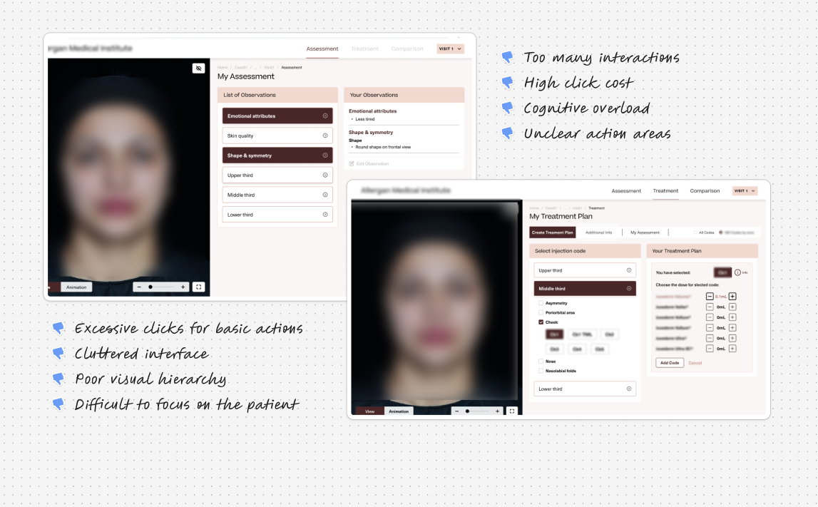
Where the Experience Was Breaking Down
After nearly two years in use, users were not completing assessments.
Despite interest, the experience felt slow and exhausting.
Users were:
- Taking much longer than expected to finish a case
- Dropping off mid-way
- Restarting the same task from the beginning when they returned
The client wanted more than surface-level UI fixes.
They wanted a fundamental redesign to improve speed, clarity, and learning.
Solution
Reframing the Experience Around Clarity and Flow
The solution focused on reducing friction and aligning the experience with real practitioner workflows.
The redesign emphasized clarity, speed, and learning continuity.
At a high level, the redesign:
- Split the experience into Assessment and Treatment
- Reduced unnecessary clicks
- Made decisions easier and visible
- Treated the app like a professional tool
Kept the 3D patient as the main focus
Research
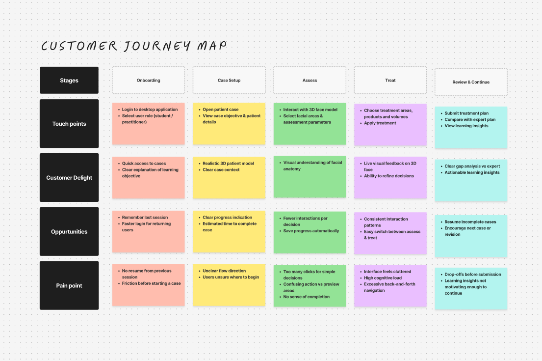
What Data and User Behavior Revealed
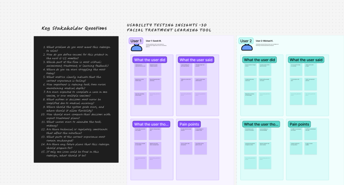
Before designing anything, I reviewed analytics and ran moderated usability testing.
This helped validate where users were struggling and why.
Together, they revealed consistent friction:
- Tasks took 2.3× longer than expected
- Each assessment required almost double the necessary interactions
- Nearly half of users dropped off mid-flow
- Users couldn’t resume progress after leaving
- Most returning users had to start over
Observed user behavior explained these numbers:
- Users frequently paused, unsure of what to do next
- They moved back and forth to recheck earlier decisions
- The experience felt more confusing over time
- Interruptions often led to complete abandonment
Key insight:
The medical logic wasn’t complex — the experience made it feel complex.
Understanding the Journey
Instead of jumping into screens, I mapped the entire user journey.
This revealed that practitioners think in phases, not long continuous tasks.
Based on this, the experience was split into:
- Assessment — understanding the patient
- Treatment — planning interventions
Design
Designing the Interface as a Professional Tool
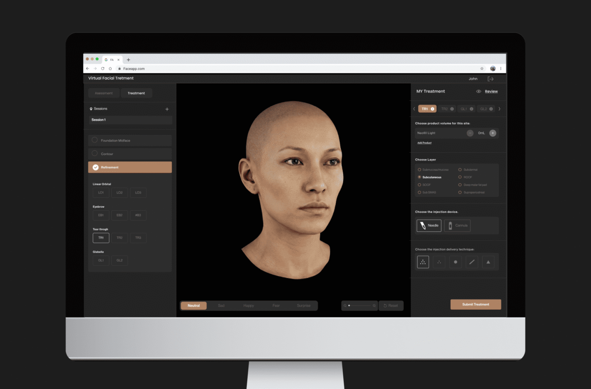
With the journey defined, the interface was designed like a professional creation tool.
The goal was to keep users oriented and focused at all times.
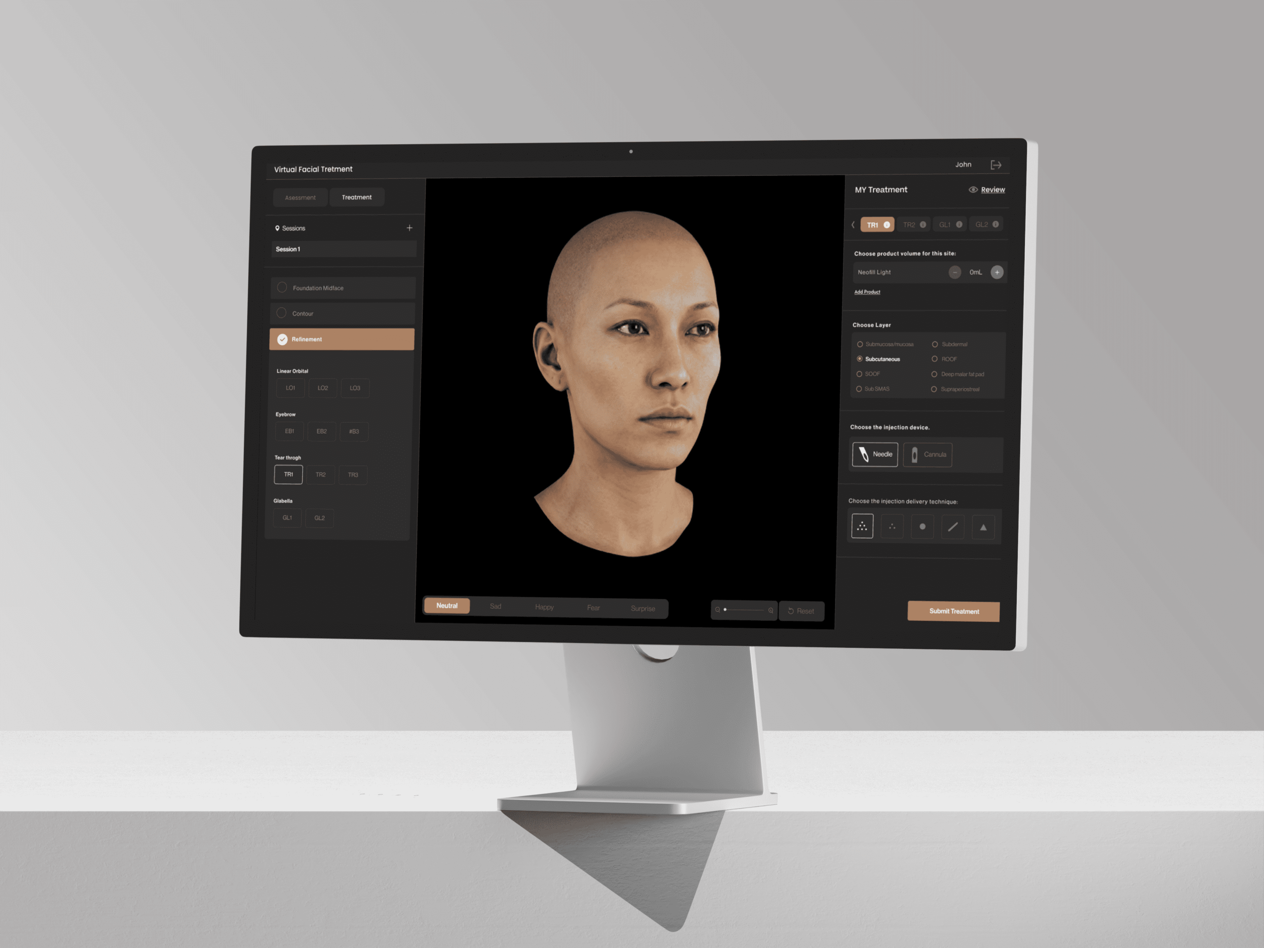
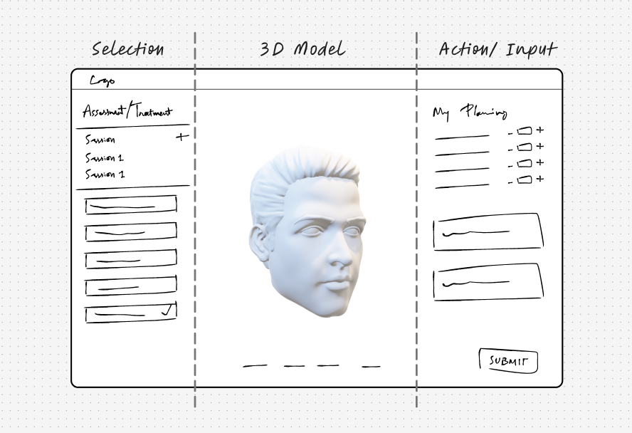
The layout follows a three-panel structure:
- Left panel — navigation and selections
- Center canvas — 3D patient model
- Right panel — actions, inputs, and parameters
A dark interface was used to enhance focus, depth, and realism.
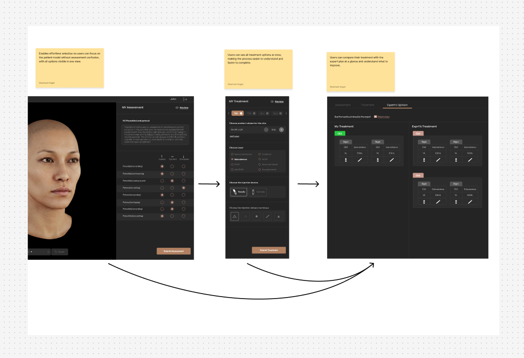
From Assessment to Learning
Users assess the patient, plan treatment, and compare their decisions with expert outcomes. The flow is designed to be continuous, predictable, and focused on learning.
Assessment Interface — Designing for Faster, Clearer Decisions
The assessment phase involves multiple small clinical decisions.
To reduce friction, accordion-based interactions were replaced with flat lists and radio-button selections.
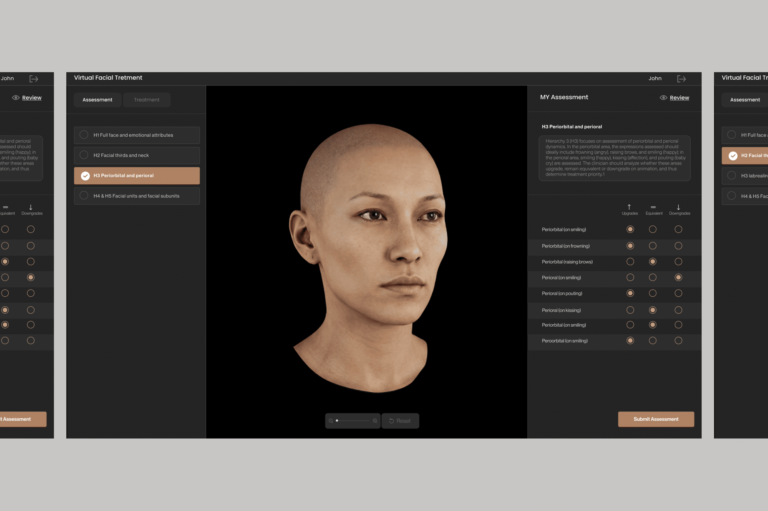
This allowed users to:
- All assessment parameters visible at once
- Single-click decision-making
- Clear selection states
- Reduced cognitive load
Focus on evaluating the patient, not managing UI
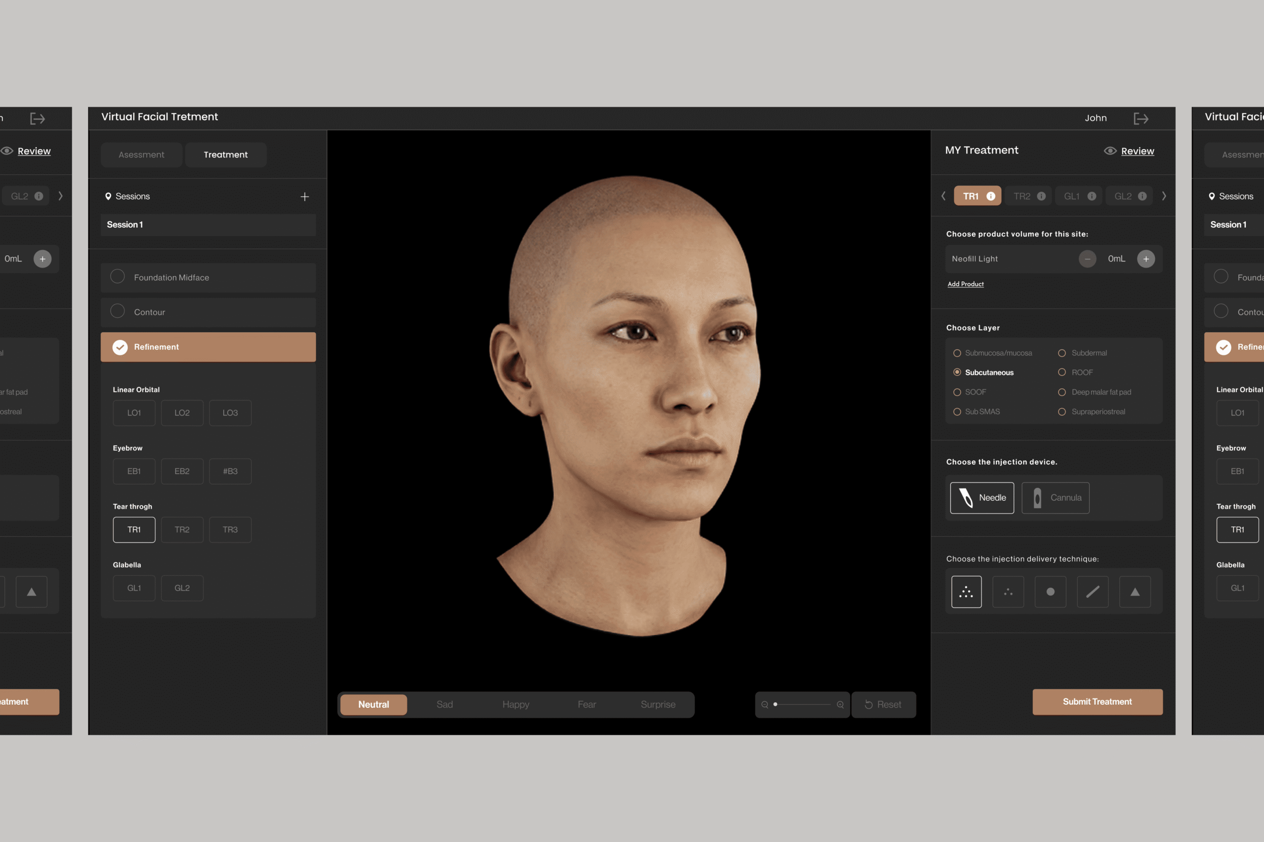
Treatment Interface — Supporting Confident Planning
Treatment translates understanding into action.
The interface was designed to support precision without increasing complexity.
Key decisions included:
- Structured decision flow
- Immediate visual feedback on the 3D patient
- Consistent interaction patterns from assessment
- Easy refinement without losing context
- Reduced interface clutter
Results
Designing the Interface as a Professional Tool
Post-redesign usability testing showed clear improvements.
Users moved faster and with more confidence.
- Faster task completion
- Fewer pauses and errors
- Predictable navigation
- Strong focus on the 3D patient
- Higher confidence from assessment to treatment
The redesigned experience aligned with how practitioners think and learn.