
A Mobile Experience for Elderly Health Support
| Team | 4 UX designers and 1 mentor |
| My Role | UX Designer |
| Responsibilities | Discover, Define, Ideate, Design, Testing |
| Platform | Mobile Application |
Overview
This was my first UX project, where I worked as part of a small team of UX designers.
The goal was to design a mobile application that supports elderly users in managing their daily health while keeping caregivers informed and involved.
The app focused on everyday needs like health tracking, medicine reminders, and communication with caretakers.
Problem
Daily Health Was Hard to Manage
Elderly users often struggle to manage daily health tasks independently.
Simple activities like taking medicines on time or tracking water intake were frequently missed.
At the same time, caretakers:
- Had limited visibility into daily health routines
- Worried about missed medicines
- Had no easy way to stay informed without constant checking
The challenge was not medical complexity.
It was memory, consistency, and communication.
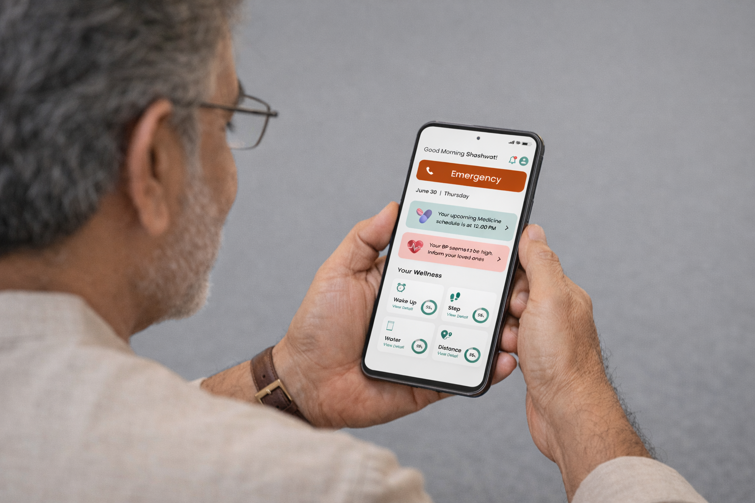
Solution
Gentle Support for Elders, Visibility for Caretakers
We aimed to design a solution that felt supportive, not overwhelming.
The app focused on helping elders stay on track while keeping caretakers informed when needed.
At a high level, the solution provided:
- Simple daily health tracking for elders
- Medicine and water intake reminders
- Notifications to caretakers when something was missed
- Clear, easy-to-understand health information
The goal was to balance elder independence with caretaker reassurance.
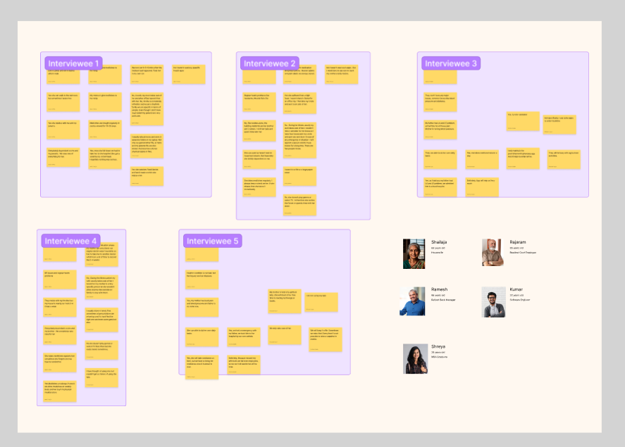
Research
Discover - Learning From Real Conversations
To understand the problem deeply, we stepped out of the classroom and into real life.
We visited public parks and walking areas, where elderly people usually spend time, and spoke directly with elders and their caretakers.
We conducted informal user interviews and conversations to understand:
- Daily health routines
- Challenges with remembering medicines and water intake
- Dependence on caretakers for medical tasks
- Comfort level with mobile phones
Talking to users in their own environment helped us see problems we wouldn’t have noticed otherwise.
Define — Understanding the Core Problems
From our interviews, a few clear problems emerged.
Elderly users:
- Forget to take medicines on time
- Don’t track water intake consistently
- Struggle to understand prescriptions
- Depend heavily on caretakers for health-related tasks
Caretakers:
- Worry about missed medicines
- Have limited visibility into daily health activities
- Need alerts when something goes wrong
We defined the core problem as:
How might we help elders manage daily health independently while keeping caretakers informed and reassured?
Ideate — Exploring Supportive Solutions
In the ideation phase, we explored ideas that were simple, supportive, and non-intrusive.
The focus was not on advanced features, but on trust, clarity, and reminders.
Key ideas included:
- Daily health reports for elders
- Water intake tracking with gentle reminders
- Medicine reminders with clear alerts
- Notifications to caretakers if medicines are missed
- Prescription scanning to avoid confusion
- Easy medicine ordering through the app
- Warnings for medicine overuse
We prioritized ideas that reduced mental effort for elders and anxiety for caretakers.
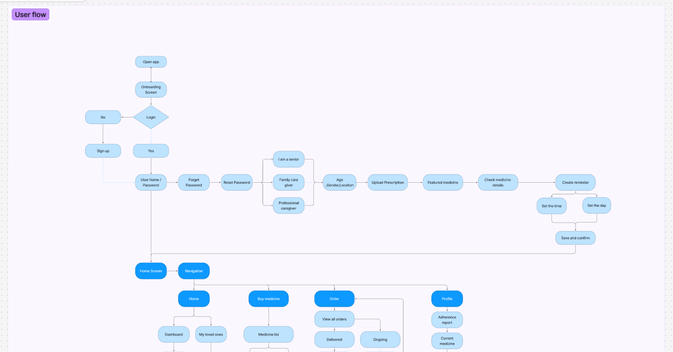
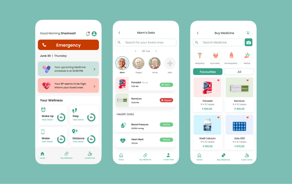
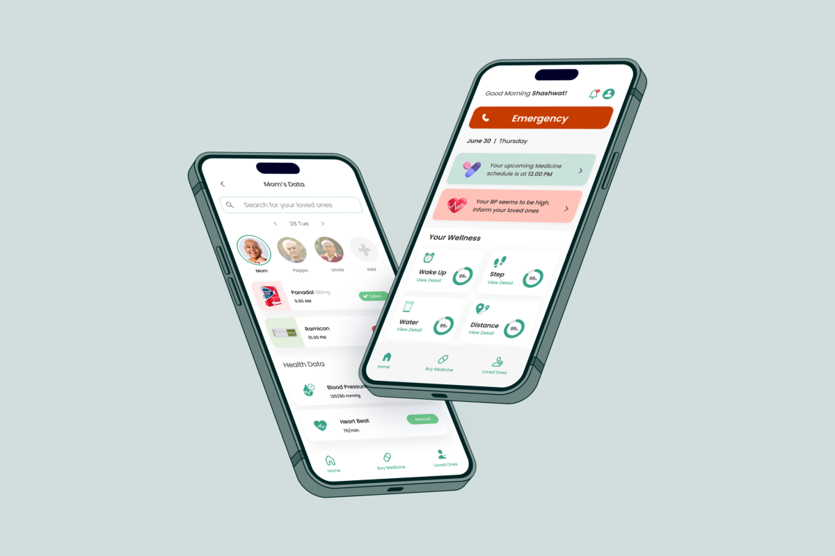
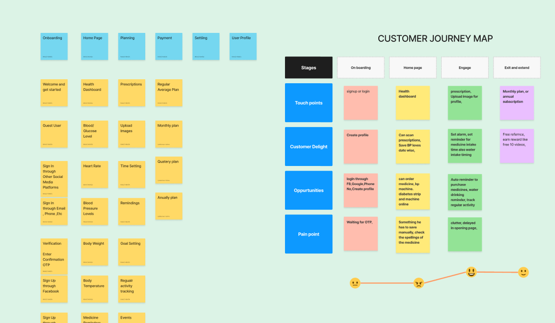
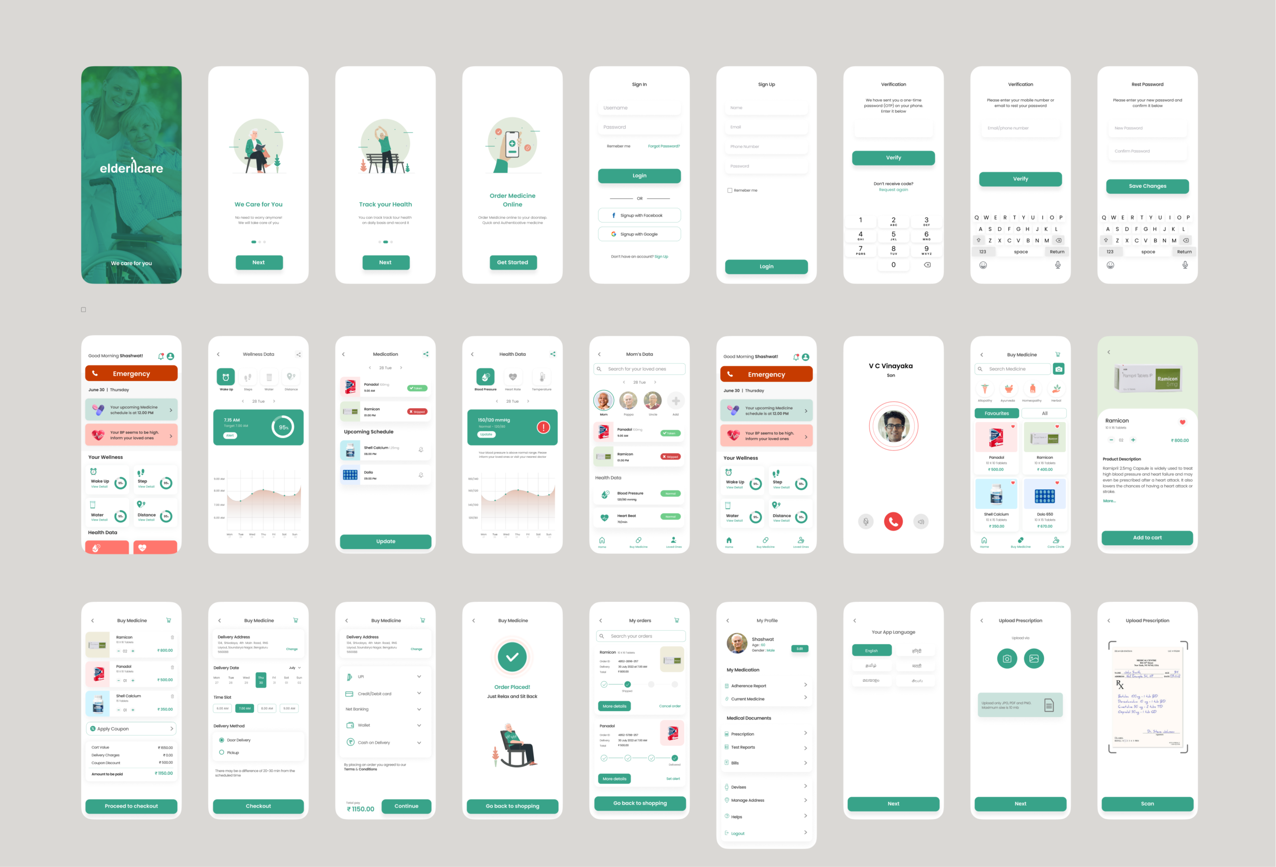
Design
From Sketches to Screens
We began the design phase with paper sketches, quickly exploring ideas and flows without worrying about perfection. This helped us think freely and discuss concepts as a team.
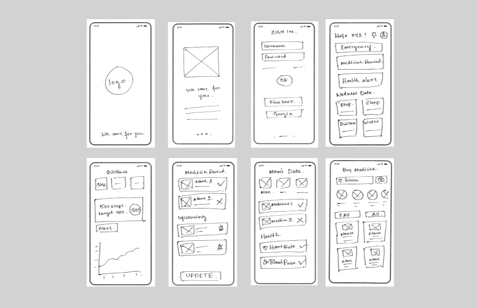
Once the core flows were clear, we moved to low-fidelity wireframes to structure screens, define hierarchy, and validate navigation. This allowed us to focus on usability and simplicity, especially keeping elderly users in mind.
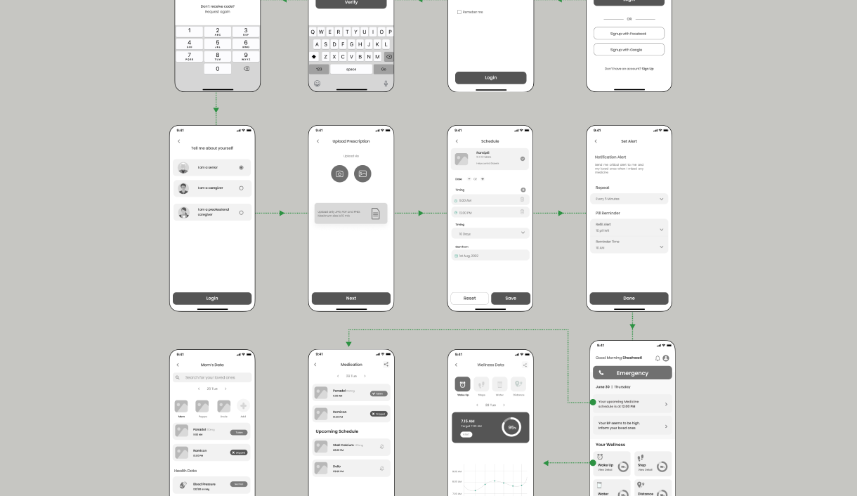
Finally, we translated the wireframes into visual screens, applying readable typography, clear icons, and friendly colors. The goal was to create an interface that felt reassuring, easy to understand, and accessible for both elders and caretakers.
Results
Validating With Users
We tested early concepts and flows by discussing them with elders and caretakers.
Instead of formal usability labs, we relied on conversation-based feedback.
What we learned:
- Elders preferred fewer actions and clear guidance
- Too many notifications caused anxiety
- Caretakers valued visibility more than control
- Simple reminders worked better than complex dashboards
This feedback helped us simplify flows and remove unnecessary features.
Outcome & Learning
The project helped us design a solution that balanced elder independence with caretaker reassurance.
More importantly, it shaped how I think about UX.
Key takeaways for me:
- Talking to users changes everything
- Real environments reveal real problems
- Simplicity is critical when designing for elders
- UX is as much about empathy as it is about screens
This project laid the foundation for my journey into UX design and continues to influence how I approach user-centered problems today.